Nice to meet you here. Wants to talk? Find me across the internet
©2025
All rights reserved. Made by Shanshan


Total Users Since Launch
In REEKON Hardware UX and Sales
Data Stored Monthly
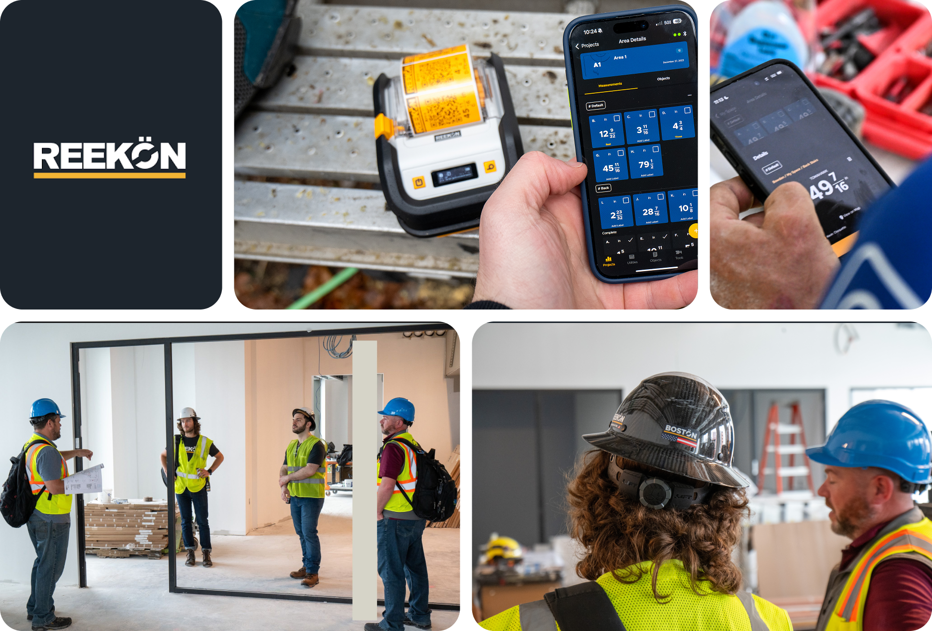
Founded in 2020 in a garage, REEKON Tools quickly disrupted the high-end construction tools market, with its innovative hardware now used across tens of thousands of jobsites.
As digital adoption accelerates within the construction industry, we identified a major opportunity to bridge the gap between traditional construction tools and modern digital workflows.
The ROCK App is designed to be the cornerstone of this ecosystem, enabling a seamless transition to a fully digital construction workflow.
Founded in 2020, REEKON Tools disrupted the high-end construction tools market with innovative hardware now used on tens of thousands of jobsites.
As the industry shifts toward digital workflows, we saw a clear need to bridge the gap between traditional tools and modern systems.
The ROCK App anchors this transition, enabling a seamless move to fully digital construction workflows.

I started with a blank slate, facing lots of unknowns and competing priorities. For the first release, I decided to focus on giving the most value to REEKON hardware users — from DIYers who want simple digital tools to construction pros who rely on REEKON’s precision.
Despite their differences, it is essential to find the common thread, and with over 100 surveys and interviews, we find:

*Collected hundreds of surveys, interviews and requests from online forum

* 76% of professional construction field still requires workers to take data down on paper

* Talked with company representatives during conferences/ events

* Talked with core partners during conferences/ events

Hardware-to-app adoption rate, engagement metrics...

DAW/ WAU, Data import rate, Data reuse rate.
Hardware sales, enterprise adoption rate etc
Three primary questions informed my design strategy:
1. How do we make transfer data easy and error free?
2. How do we add value to these data?
3. How do we make these valuable data accessible for more people?
To answer these questions, I went back to the field and started understanding the specifics of their workflow

Site Managers need to distribute task among workers.
Supervisors need to organize and report site data to stakeholders
Engineers need to validate if values are within tolerance
We defined below core process to ensure we maximized the value of data in the process and design is scalable.


One crucial difference between the ROCK App and other consumer applications is its intended environment—the jobsite. We must factor in unpredictable, high-intensity real-world conditions:

Workers are usually with hands full or work at heights
Noisy, chaotic environment makes giving instructions almost impossible
Many construction professionals are accustomed to traditional pen-and-paper workflow
Building the RORK APP wasn't just about adding feature- It was a journey of unexpected challenges, tough decisions, and critical pivots.

For an app centered around data management and organization, information hierarchy is one of the most critical design elements. Our initial design approach prioritized flexibility. We introduced a Google Drive-like file system, allowing users to:

Enabling users to categorize projects, jobsites, or measurement types in a way that makes sense to them.
Supporting measurement data, annotated photos, reports etc, ensuring that all essential jobsite data is accessible in one place.
However, during beta testing, our enterprise partners raised a critical concern: to our surprise, they do not like how "free" the structure shows.
When we dug in, we found that the importance of setting a standard and established process is crucial to most construction workflows. And the freedom actually makes standardization harder and slows down adoption.
Although frustrating, we took a step back and carefully listened to their feedback. After throwing out all pre-set ideas, doing deep research and getting full buy-in from stakeholders, we made the call to pivot to a fixed, standard structure.
After heated discussion, I aligned major stakeholders and made a business decision: we will pivot the design to a fixed, more structured hierachy.
To validate the shift from free-form to fixed structure, we researched heavily in major construction workflows and come up with a structure that would scale to most scenarios.

By introducing the fix, multi-layer structure, we had to think carefully about how the extra complexity might affect our less-professional, DIY users.
I ran some research and verified my ideas: DIY users expect quick, easy access to their data with as little effort as possible. Extra layers just feel like unnecessary work to them.
I redesigned the experience: keeping the structure while making it feel invisible.


Users are provided with default workspace and automatically navigate to page where they can directly view data. Hirearchy management and customization are hidden in burger menu.
With the introduction of a more complex hireachy, there's more interactions involved. We consolidated them into a central "+" button.
Visual adjustments like reducing header sizes, enhancing color contrast and increasing data visualization scale to emphasize what truly matters to DIY users.

For more story behind Custom Template, I'd be happy to share more insights and walk you through the journey—just let me know!
